

Bernie Fuchs, Portrait of an illustrator.
By Mary Anne Guitar (1962)
Editor’s Note: Illustrator Bernie Fuchs was barely thirty years old when he was named “Artist of the Year" by the Artists Guild of New York in 1962. In spite of his youth, Bernie Fuchs is quite influential in his field of commercial art. Recently, he joined the Guiding Faculty of the Career Course of Famous Artists School. With his wife and three children, he lives in Westport near the School. A short time ago, Mary Anne Guitar interviewed him for Famous Artists Magazine.
Interviewer: Did you decide early—in high school, say—to become an artist?
Fuchs: No. As a matter of fact, I was aspiring to be a musician, but I did draw a lot in those days.
Interviewer: Who decided that you should go to Washington U. and become an artist?
Fuchs: My mother did.
Interviewer: Did you give up your interest in music when you went to school?
Fuchs: Well, I played trumpet in a dance band all through school. I still fool around. As a matter of fact, I got a new trumpet for Christmas this past year.
Interviewer: What was the most important thing you got out of art school?
Fuchs: It kept me working. That’s what it does for you. You get interested and you apply yourself.
Interviewer: Did you do any free-lance work while you were in college or work summers in the art field?
Fuchs: I guess my first commercial art job was the summer after freshman year, in a toy factory where they made hand puppets. There was a girl who had graduated as a sculptor, and she made the moulds for the faces and then the blank heads would travel down a conveyor belt. They had to be sprayed with a base coat of white paint. I was one of the ones who did that. I never did work up to the best job; at the end of the line there was a guy who would paint on the faces. I wanted to do that, but they would not let me. Between my junior and senior years, I worked in an art studio. I was a mat boy, but they would let me do other things. The place reeked of rubber cement and benzine, but it was an experience. Then, in my senior year, along with some other students, I did storyboards for an educational TV station. They wanted all kinds of crazy things done. I don’t think anybody got paid, and the station finally went broke, but it was fun.
Interviewer: When you were in school you must have been very much aware of the top illustrators. Who were your favorites?
Fuchs: I liked A1 Parker and, of course, Austin [Briggs]. My idols were the whole Cooper Studio crowd. I think Jon Whitcomb worked for them.
Interviewer: Did you hope someday to work for Cooper? Fuchs: Oh yes. But that was a pretty far-fetched dream for an art student.
Interviewer: How did you get your first full-time job after finishing school?
Fuchs: A graduate of Washington U. came down from Detroit, where he ran an art studio, and looked over student work. He invited a friend of mine who was interested in illustrating automobiles to come up to Detroit and bring his samples. I went along with him. We were offered three jobs and accepted the best one in a studio there. There was so much work in Detroit in those days it was unbelievable.
Interviewer: I understand that painting cars and the backgrounds for them requires a special technique. Did you have trouble picking it up?
Fuchs: I learned. You had to learn or get out. Painting people in behind the steering wheel or on the seats was known as “stuffing cars.” It was difficult work. Some guys were just great at it. There were assignments of all types in Detroit, not just passenger cars. I did a lot of little spots in the beginning-tractors and machinery. You do these things well and suddenly you’re doing cars.
Interviewer: YOU worked in this, your first real studio, for about two years and then started your own studio. You were only 23 at the time. How did you have the courage, and what made you do it?
Fuchs: I didn’t start it all by myself. There were six of us, the nucleus of the studio, and we were urged to do it by one of the top salesmen who organized our new studio. Immediately we were the hottest thing in town. We really flew for two or three years. As for why we did it, every one of the guys had his own dream. One of them wanted to own his own home, for example. I said that I wanted to go to New York and become an illustrator.
Interviewer: YOU mean after you had put aside enough money?
Fuchs: Not just that. The studio could provide me with contacts in New York. Our salesmen went there because we worked with McCann and J. Walter Thompson, the big agencies which were based in New York. They could show my work to New York clients, and that way I was able to break in. Finally, I decided to move my family East.By then I was married with two children. The studio decided that since I was going they might as well have a New York office.
I bought a house in Westport and worked out of that New York office for a time. Then I quit the studio and started free-lancing. It seemed time to break the tie.
Interviewer: What was your first editorial job in New York?
Fuchs: Actually, the first one came while I was still in Detroit. Herb Mayes, then editor of Good Housekeeping, saw an ad I had done. (His art director claimed he saw it first.) He asked me to illustrate a story for the magazine. When Mayes went to McCall’s, he got me to work for him there.
Interviewer: YOU make it sound so easy and effortless. How difficult is it, really, to attract attention and clients so you can free-lance with security?
Fuchs: If kids get out of school and have something the art director hasn't seen before, he’ll grab it. The whole field is wide open. They are waiting for something different.
Interviewer: In your own experience, what is the most difficult stage in working out a picture?
Fuchs: Getting the idea, that’s the hard part. I try to find the thing in the story—whether it is an incident, a portrait of a character, a symbol or whatever—that I feel is most worth translating into a picture. My aim is not merely to decorate the page but to make illustrations that will contribute to, and perhaps heighten, the meaning, drama and emotion of the words. Sometimes this is easy. More often, it is not. Sometimes the art director will supply the picture idea, and even prescribe just how he would like to have it arranged. But usually he is interested in what the artist has to say and is glad if he can come up with something better. Of course, you should get personally involved with the picture. You have to search if something doesn’t hit you personally. Then you have to search for that involvement. And it may not be there.
Interviewer: Must you illustrate the content of the story quite literally or can you illustrate a scene that is suitable but not necessarily described by the author?
Fuchs: If you are illustrating fiction you can take a character from the story and put her in a setting that might not be described by the author but which could belong to the story. If your choice is appropriate this license is permissible. The title or opening sentence can also give you an idea for illustration.
Interviewer: Have you ever been given a story to illustrate which simply didn’t interest you? You couldn’t get involved with the characters or the situation. What did you do then?
Fuchs: I sometimes tell the art director that I can’t think of anything. It does happen. I suggest that he get another artist. I hate to do it, though, because he may not call on me again. The opportunities don’t come along that frequently.
Interviewer: In searching for the idea, you undoubtedly call upon your own observations of the life around us. Do you think the illustrator must be “a noticer,” observant of the clothes, manners, look of his time?
Fuchs: If you are not observant you are lost to begin with.... You go to parties. You know what’s happening. What you pick up can’t always be reflected in your work, but it is important that you keep your eyes open.
Interviewer: DO you go to museums, collect art? Who are your favorite painters?
Fuchs: I hardly ever get to museums as much as I’d like to, except when I am in Europe. I don’t collect art, and I don’t really have any favorites. I like Bonnard and Vuillard, though.
Interviewer: Many illustrators use the camera as a research tool to help them pin down detail for their pictures. I know that you do. In fact, one knowledgeable observer has said, “What’s unique about Bernie is that in his hands there’s not that direct photographic copy that sometimes shows in an illustration. There is a vitality to the thing that is very different, very evident. He conveys the impression that he draws directly from the source.” How helpful is the camera to you?
Fuchs: Taking pictures not only gives me the visual details I need, but it gets me involved in the situation and the scene. The camera takes it down. It is a thing to use. I don’t have total recall. I don’t think anybody does. When I get home I can picture you in my mind, but I can’t remember well enough to draw you. We used to have sessions in Detroit late at night when we were working on a job. We would take a break and go into the mat room and three or four of us would gather around a table and somebody would say, “Remember so-and-so?” It would be a Grade B actor in the 40’s. And we’d all say, “Sure, sure. I remember. What did he look like?” We’d stand around the tissue and try to draw him. You had him there, in your head, but you couldn’t put him down. That’s why I use models. I photograph them doing things that the characters in a story are doing. When I work from the photographs, I can remember how they moved and looked, because I was there. When I am asked to draw somebody who is well known, like President Johnson, it seems important to me to meet him, to see him in person. It always helps to meet somebody. Then you can use your camera to record your impressions of him.
Interviewer: When you were invited by the Amalgamated Lithographers of America to paint President Kennedy, did you work that way?
Fuchs: Yes. I went to the White House and I met him. Of course, the impression he gave you was tremendous. He was the handsomest, healthiest-looking man. Seeing him was an unbelievable experience. He always had a tan and his eyes were blue, and the whites of his eyes were so white. That’s what I tried to get without making him look like a movie star.
Interviewer: YOU have painted John Kennedy several times, most particularly for the Look serialization of the Theodore Sorensen book and the John Hancock ad you did on the anniversary of his death. I understand the ad brought the greatest response they ever had to one of that series.
Fuchs: That was because it was of Kennedy, not because I did it.
Interviewer: Can you explain why magazines turn to artists as well as photographers when they want to illustrate a nonfiction piece? Is it because the illustrator can heighten the drama of an event, not simply document it?
Fuchs: I was chosen to do these assignments because I was an illustrator. You think of pattern and dramatic quality, not a literal reproduction of reality. But the drama is put in by the person who sees it. You really have a physical reaction to a painting of an important person because of all you know about him.
Interviewer: There is a feeling of strong pattern in much of what you do. I remember one picture of Kennedy and his father. There was no distraction. You felt the power of the man immediately. Can you describe the way you use pattern?
Fuchs: Pattern is another word for composition. It is something to hang a picture on. You get an idea of pattern; sometimes it is an object or the way a person sits, something you would like to paint. I’m always looking for a place to start. Sometimes the pattern just happens while you are looking for something else.
Interviewer: What makes a picture work? Is it the relationship it bears to the story, the response it evokes, or the quality of the art?
Fuchs: I guess it is all of these combined, with the balance tipped perhaps to the better picture. But if it doesn’t illustrate the story, you’ll hear about it. The people you are selling it to are usually aware of what the story is about and want that illustrated. It has to do that job.
Interviewer: Have you ever had a problem satisfying both the client and yourself? Any conflict with art directors?
Fuchs: The very first time I ever held out for something I believed in, I won. I turned in a rough for an advertisement, one I liked. The client gave it back and suggested other ideas I might try. I didn’t like any of them—too corny. I didn’t know what else to do with the picture and so I told them if they didn’t like my version, maybe they should get another artist. I didn’t hear from the art director for a couple of weeks and I thought that’s what they had done. Then he called me and said, “You can do it your way.” After the ad was published, they had a big response to it. All of a sudden I was a hero.
Interviewer: IS the conflict usually centered on a difference of opinion about the concept of the picture or do you ever disagree about technique?
Fuchs: YOU can. I once submitted a sketch for an ad, and my agent brought it back with instructions from the ad director to tighten it up. I told the agent to tell him that if I were to do anything to this, I would do the finish twice as loose.
Interviewer: DO you ever compromise?
Fuchs: Sure. Everybody gives. You give on both sides. You learn from people you work for. You try to take three steps forward and only two back. In some way you develop. What gets you, though, is when they want you to do something like the things you did five years ago. They haven’t seen what you can do or, if they have, they don’t want it.
Interviewer: DO you think editorial art influences advertising art or vice versa?
Fuchs: It used to, but now I think advertising influences editorial.
Interviewer: What is the best and the worst thing about being an illustrator?
Fuchs: Being one of the fortunate ones, I think the best thing is that you can run your own life. But it’s still work. Some mornings you are able to wake up and say something swinging. Most mornings it’s hard to go in the next room and get to work. I have very bad self-discipline. Once you start a picture, you have to go the distance. Whether you are good or not, you go there. If you get all the way to the end, you give it a try and hope it sells.
Interviewer: Can you imagine yourself in any other field? 0
Fuchs: I would like to work with the movies. I don’t know if I will ever take the chance. It’s exciting to put together movement and sound, though.
Interviewer: What about the ever-threatening problem of getting stale? Are you worried that you will paint yourself out because your work is in such demand?
Fuchs: That’s your fight for survival. Each job you do has to be a little bit more exciting than your last. This is always in the back of your mind on every new job—to improve and experiment and be a little bit different than you were before.

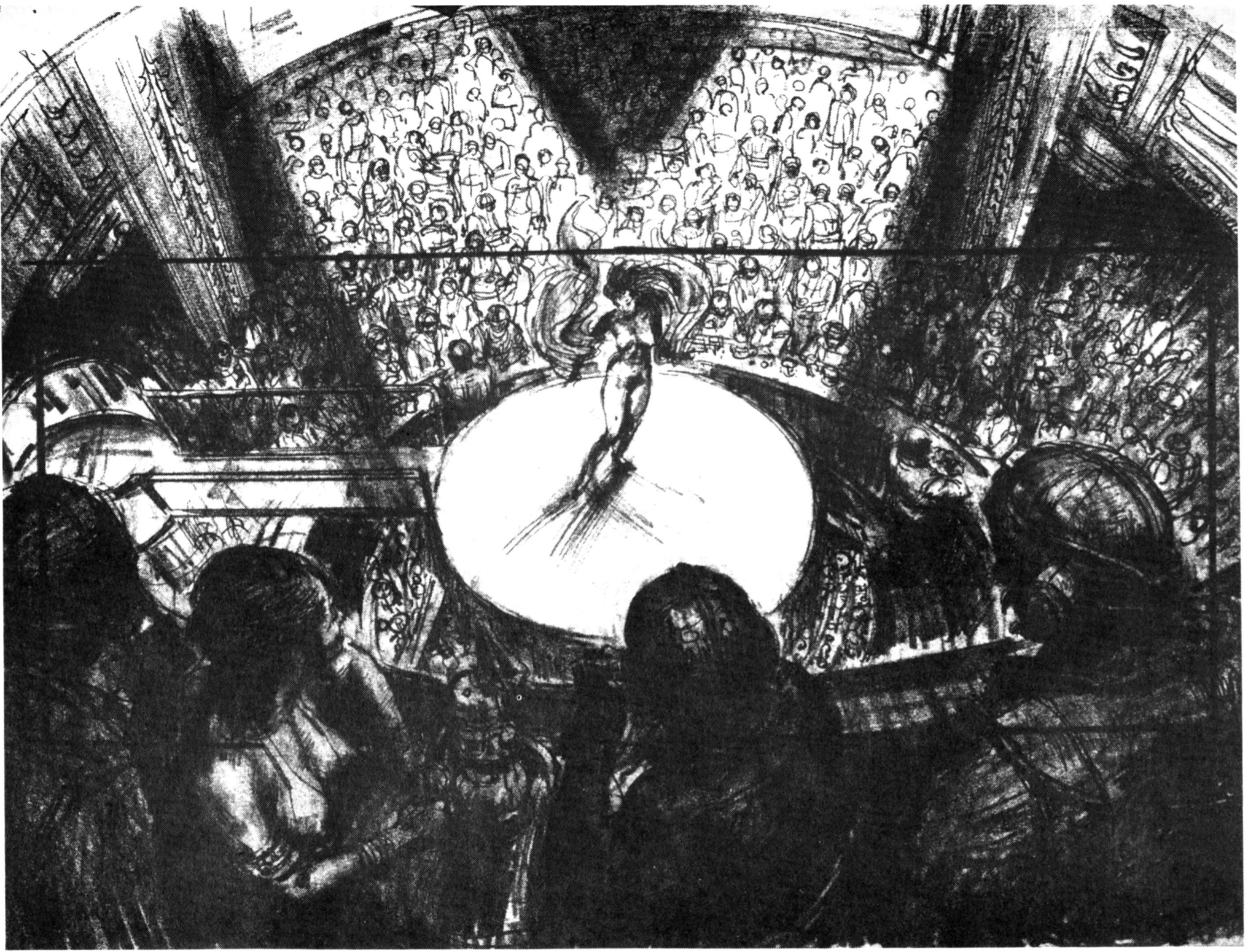
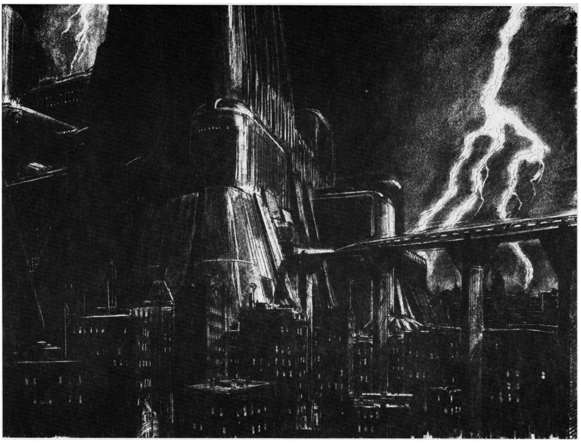
Mentor Huebner Art for Blade Runner
Mentor Huebner (July 19, 1917 - March 19, 2001) was a leading Hollywood production illustrator who did storyboards, production art and creative concepts for more than 250 films, including King Kong (1976), Blade Runner (1982) and Francis Ford Coppola's Dracula (1992).
His early work was uncredited on Fiddler on the Roof (1971), The Time Machine (1960), Ben-Hur (1959), North by Northwest (1959), Forbidden Planet (1956), Quo Vadis (1951) and Strangers on a Train (1951).
As a fine artist, Huebner painted landscapes, seascapes, cityscapes and portraits, creating some 2000 paintings and exhibiting in 50 one-man shows. He also taught art as an instructor at Chouinard Art Institute.


Alberto Breccia Sketchbook (Part1)
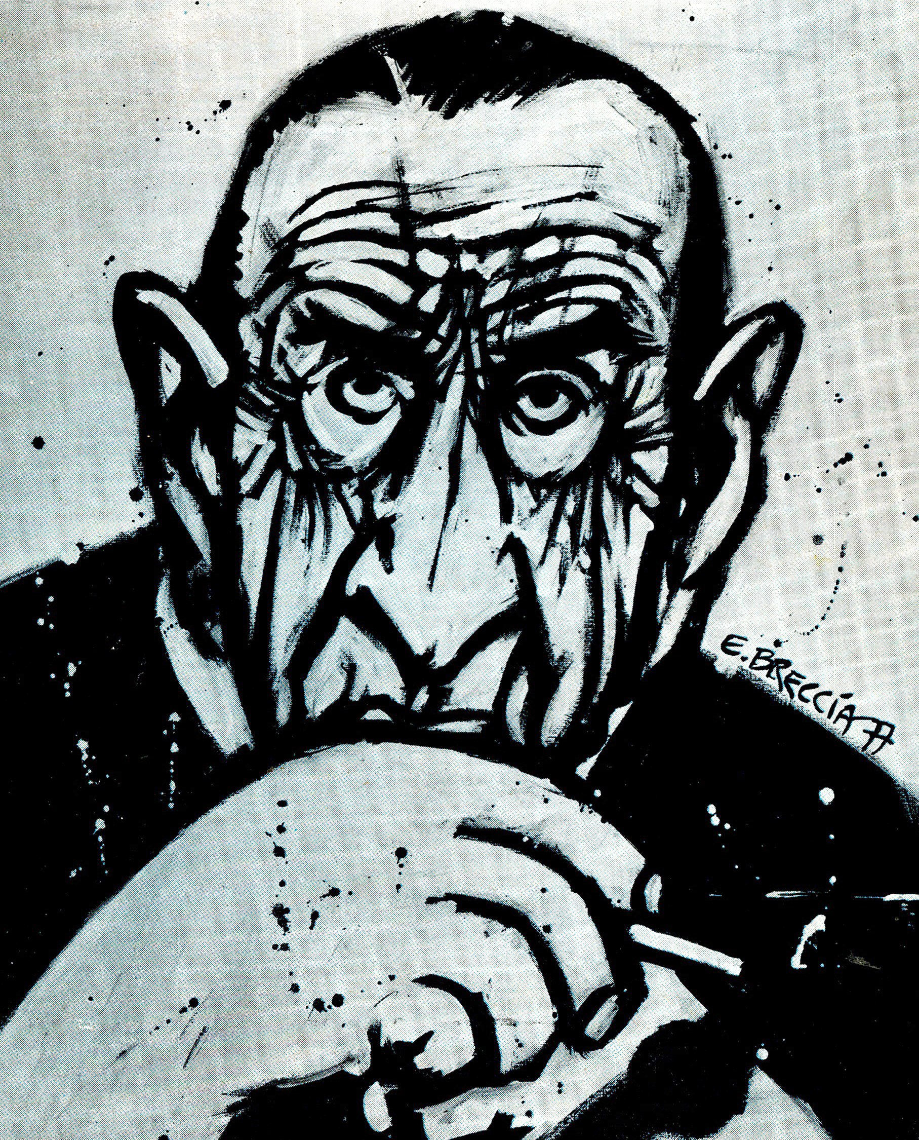
Alberto Breccia (Uruguay, 1919) was the greatest artist of the Argentine comic of the 20th century.
He was a tireless innovator, impossible to classify, and the most awarded, admired and copied author of the country.
Winner of several awards, among which it is worth mentioning that of Amnesty International for his series Perramus (with script by Juan Sasturain), he was also the co-creator of comic classics such as Mort Cinder (with Oesterheld), the exceptional story of the Che Guevara’s life (with his son Enrigue and Oesterheld), and the grotesque saga of Buscavidas (this time, with Carlos Trillo). Immense adapter of literary works (among which Informe sobre ciegos, by Sabato and Tale oF the Cthulhu Mythos, by Lovecraft, are outstanding) and a great illustrator and painter.
This huge artist ended his career achieving his dream: to adapt the stories of the author he admired the most: Jorge Luis Borges.
He died in Argentina (where he was living since he was ninety three years old) in 1993.
His working method, his particular vision to approach and develop a story, his exquisite talent when adapting complex literary works and his tireless quest for new styles and shapes have always been one of the great questions in the life of this author and that only a few chosen ones knew.
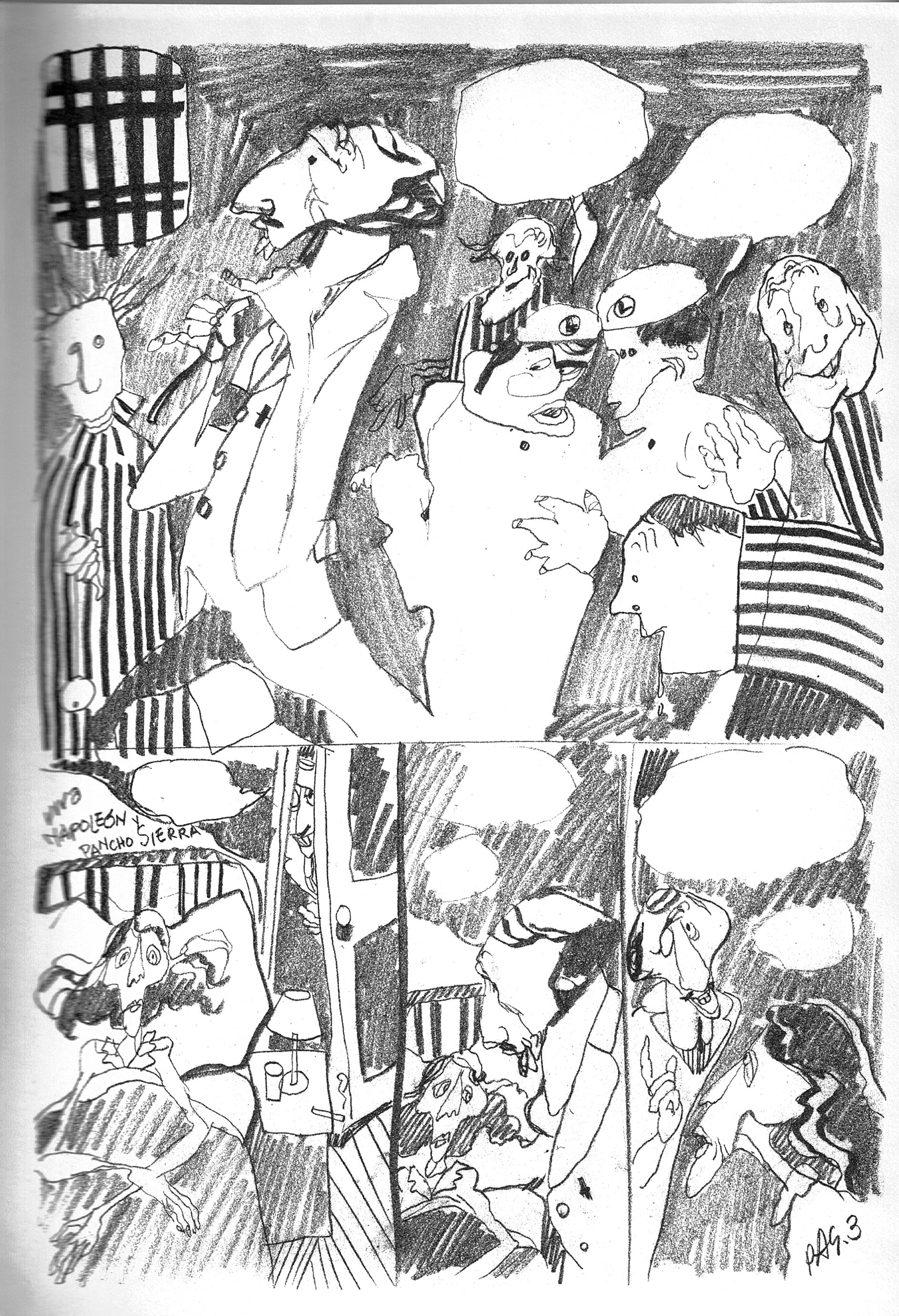
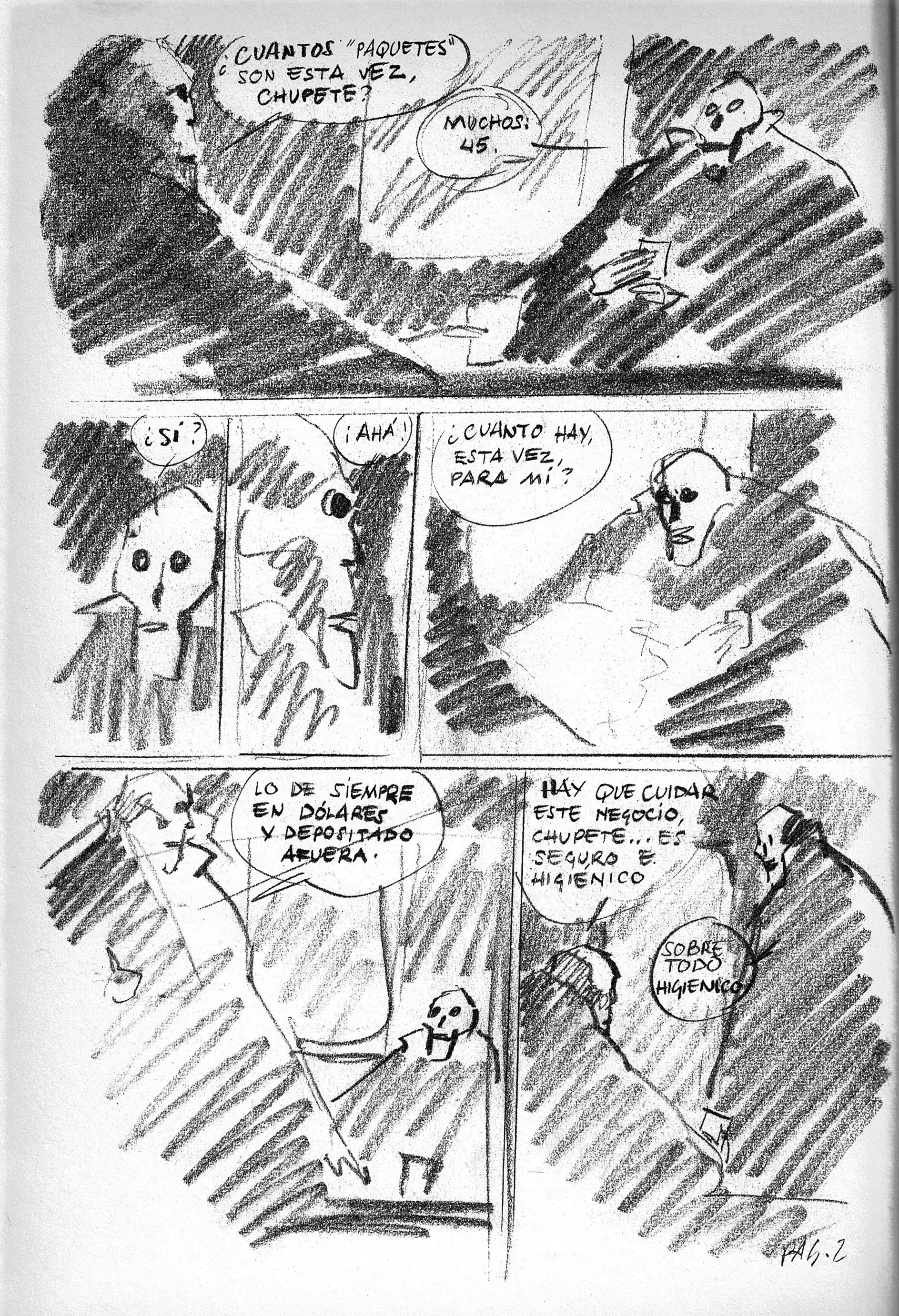
BUSCAVIDAS
"One day I received a phone call and an anonymous voice told me that my house was going to be dynamited: I had to hide for a season. It was during this somber period that I started to draw Buscavidas. It was a story full of symbols and hidden references; I tried to keep on drawing avoiding trouble. I had to do things that, at least on the surface, were drinkable'... If one day they had come to the house, I would always have been able to tell them: 7 am drawing a weird thing, a bit funny, a bit grotesque'. Maybe that way I would be able to make them smile and avoid being killed by blows with a cross. The military were mistrustful and ignorant."
Frame from the unpublished episode of Buscavidas. There, Breccia himself appears as the antique dealer of the Mort Cinder series (Mort himself also appears) who receives the visit of the Buscavidas at his antique shop. On the table, among several weird objects, you can see a horrible statuette of the dictator Videla.
(Editor's Note) This chapter was not written by Trillo and I suppose that, maybe, Breccia created it to complete the pages of the series for an eventual publication in a book. Unfortunately, the comic is drawn and turned into ink, though without the text (and the script is nowhere to be found!).


PERRAMUS
"The main reason for me to start Perramus was the need to render testimony about all that happened in Argentina during the military dictatorship; it was my duty to do it. Drawings were, and still are, my only weapon; with it I protest: Perramus was a protest scream, an uprising scream. Now the situation in Argentina has changed: not completely, but to a great extent. There are also many reasons to keep on protesting nowadays, but it is not my job anymore... You should never stop protesting..."
Initial outline and definite cover of the French edition of Glenat. (On the opposite page: finally discarded version)


LOVECRAFT
"(With Lovecraft) I accepted the challenge completely: I wanted to know if I would be able to draw what Lovecraft wrote. I don't know if I have achieved it, but I can assure you that, for two or three years —I don't remember how long it took me-, I lived completely immersed in Lovecraft's world. I rejected other work offers and the only thing I read was Lovecraft and studies on his work. At the same time, I experimented with new techniques in an attempt to render back, as faithfully as possible, what the writer imagined in his stories."


Extract from Ancares Editora

Dorothea Holt
Published in December 10, 2016 in ArtCenter // Written by Hugh Hart


Restless, fierce and gifted, 1936 Illustration alum Dorothea Holt Redmond produced scenic designs for Alfred Hitchcock that visualized the director’s appetite for suspense with uncanny precision. Mentored by ArtCenter founder Edward “Tink” Adams after studying architecture and interior design at the University of Southern California, Redmond began collaborating with Hitchcock shortly after she became the first woman to join the ranks of Hollywood production designers in 1938.
“Working on Gone With the Wind”, Redmond weathered considerable workplace resentment, according to her son, filmmaker Lee Redmond (BFA 73 Photography). “It was really difficult when she started out in motion pictures but my mother didn’t take crap from anybody,” he says. “She’d walk into male-dominated places and deal with all these snide comments because she was better than anyone else in the room.”
Redmond, who died in 2009 at age 98, recently earned posthumous entry to the Art Directors Guild’s Hall of Fame for her contributions to mid century cinema, including Hitchcock classics “Rebecca”, “Rear Window” and To “Catch a Thief”. “Hitch was very fond of my mother because she used light and shadow to create moods with her layouts,” says Mr. Redmond. “Very few people painted that way.”
To spend more time with her son and her daughter Lynne, Redmond in 1956 quit movies, taught at ArtCenter and created concept art for modernist architect William Pereira. Her unsigned watercolors included renderings of the now-iconic LAX theme building, featured as the signature image in the Getty Research Institute’s acclaimed 2013 exhibition Overdrive. Lee Redmond recalls, “My mother did not love modern architecture but the concrete spider she did for LAX really resonated for her.”
In 1964, Redmond joined the company today known as Walt Disney Imagineering. There, she designed Disneyland’s ornate New Orleans Square and conceived the archway mural for Walt Disney World’s Cinderella Castle, constructed to her exact specifications from a million pieces of colored glass.
Whatever the project, Redmond favored a brisk way with the brush. “I loved watching her paint because there was no hesitation at all,” her son Lee recalls. “Everything was direct, straightforward, right on point, and then you’d start to see something emerge from color. Using a minimal amount of paint, she had a knack for capturing a feeling that allowed your brain to fill in the spaces in between.”
Vertigo Storyboards
Director: Alfred Hitchcock
Storyboards: Henry Bumstead
Henry Bumstead was an American cinematic art director and production designer. In a career that spanned nearly 70 years, Bumstead began as a draftsman in RKO Pictures' art department and later served as an art director or production designer on more than 90 feature films. He won Academy Awards for Best Art Direction for To Kill a Mockingbird (1962) and The Sting (1973). He was also nominated for Academy Awards for his work on Vertigo (1958) and Unforgiven (1992).
Pather Panchali (1955) Storyboards
Director: Satyajit Ray
Storyboards: Satyajit Ray
Pather Panchali (translated as “Song of the Little Road”) was Satyajit Ray’s first film, adapted by Ray from a 1928 Bengali novel of the same name. Previously, while working as a graphic artist at a Calcutta publishing house, Ray illustrated a children's version of the novel, and it remained dear to his heart as he moved closer to realizing his dream of becoming a filmmaker.
Filming on Pather Panchali started, financed by the director’s own funds and any loans he could raise, in 1952, when Ray was thirty-one years old, and collapsed and restarted on various occasions, only finishing in 1955 thanks to a grant from the Museum of Modern Art in New York.
Throughout the three years of intermittent production, Ray searched for funding armed with two tools to show potential backers. One was a small notebook, filled with sketches, dialogue, and the treatment; the other was more of a sketchbook containing gouache illustrations of the film’s key dramatic moments. Ray later donated these to the Cinematheque Franqaise in Paris.
With its extraordinary, naturalistic sequences—Ray was inspired by the Italian neorealist movement—Pather Panchali never had a complete script and was made entirely from these sketches and notes. The original drawings have sadly now been lost, but these black and white copies still reveal the beauty of his preparatory work.
Pather Panchali tells the story of a Brahmin family in Bengal at the beginning of the last century. The father is an impoverished priest, and the mother is left alone to look after impish older daughter Durga and young Apu. Pather Panchali's neorealist take on the Bengal countryside (Ray was inspired by Vittorio De Sica’s 1948 film Bicycle Thieves') is rightly hailed for the magnificent beauty and majesty of its black and white sequences, which detail the simple joys of life for a small boy. Perhaps the most famous of these depicts Apu and Durga running through kans grass to see a train; on their return, they find the dead body of their Aunt Indir. Music by Ravi Shankar heightened the intensity of emotion.
Pather Panchali was the first in Ray’s Apu Trilogy, and was succeeded by Aparajito (1956) and Apur Sansar (1959).
Who’s Afraid of Virginia Woolf? Storyboards (1966)
Director: Mike Nichols
Storyboards: Maurice Zuberano
Mike Nichols was the most successful, sought-after stage director in America by the time he was approached by Warner Brothers to adapt Edward Albee’s 1962 play Who’s Afraid of Virgina Woolf? for the big screen. He had no film experience, but he was also unafraid—and the quality of his production team was unrivalled (from Haskell Wexler’s camera to Richard Sylbert’s production design).
The producer Ernest Lehman agreed to have the experienced illustrator Maurice Zuberano at Nichols's side throughout the production, which starred the powerhouse couple Elizabeth Taylor and Richard Burton as Martha and George (the scenario was thought to reflect the troubles of their own marriage). Nichols and Zuberano worked closely together, as this storyboard illustrates—it comes close to being an animated stage direction. Sylbert also worked with the storyboard artist Harold Michelson on this film. Who’s Afraid of Virginia Woolf? was nominated for thirteen Academy Awards—including for Nichols as director—winning five, among them Elizabeth Taylor’s second for acting.
Maurice Zuberano’s storyboards is littered with character notes, stage directions, and snatches of dialogue, reflecting the close working relationship between Zuberano and the film’s director, Mike Nichols.
Maurice Zuberano started out as a storyboard artist on the ultimate Hollywood classic, Citizen Kane (1941). He may well have provided the boards for Orson Welles’s followup, The Magnificent Ambersons (1942; see pages 40-45), although he was not credited on the final, much-edited film. He certainly enjoyed a close relationship with Welles’s editor on both pictures, Robert Wise, and they continued to work together when Wise made the jump to directing, on Helen of Troy (1956), West Side Story (1961), The Sound of Music (1965), and Star Trek: The Motion Picture (1979). Zuberano’s last work was for Warren Beatty, on the director/ star’s Dick Tracy (1990).
Drawings by Writers

Henry Miller (1891-1980) spent as much time painting as drawing. When impoverish and living in Big Sur, California, he bartered his watercolours for food, clothing and fuel. He said: ”Paint as you like and die happy”.

Charles Baudelaire (1821-1867) made caricatures and sketches, many of which were self-portraits like the one above, drawn after smoking hashish.

Vladimir Mayakovsky )1893-1930) called this rare pen and ink drawing, done in 1928. MAN STRIDDING TOWARDS THE SUN.

Paul Verlaine (1844-1896) drew Arthur Rimbaud repeatedly during their two-year friendship. In 1873, drunk on absinthe, Verlaine shot Rimbaud in the hand. He spent several years in prison as a result and they never saw each other again.
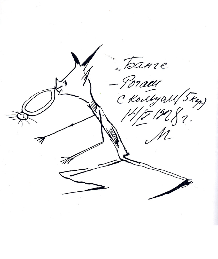
Mikhail Bulgarow (1891-1940) made this drawing of the household devil, Rogash, in 1928.

Jean Cocteau (1889-1963) “Love Letter” from DESSINS, first published in 1928.

Franz Kafka (1883-1924) made this sketch in his diary, in 1924: “ I write this very decidedly out of despair over my body and over a future with this body…”

Djuna Barnes (1892-1982) made this drawing of Gertrude Stein although the two writers did not get on. Of their first meeting Barnes later wrote: “D’ you know what she said of me? Said I had beautiful legs. Now what does that have to do with anything?”

Federico García Lorca (1893-1936) drew, painted and made puppets; the inscription on this drawing, which shows the influence of surrealism, reads: “Only through mystery do we live, only through mystery.”
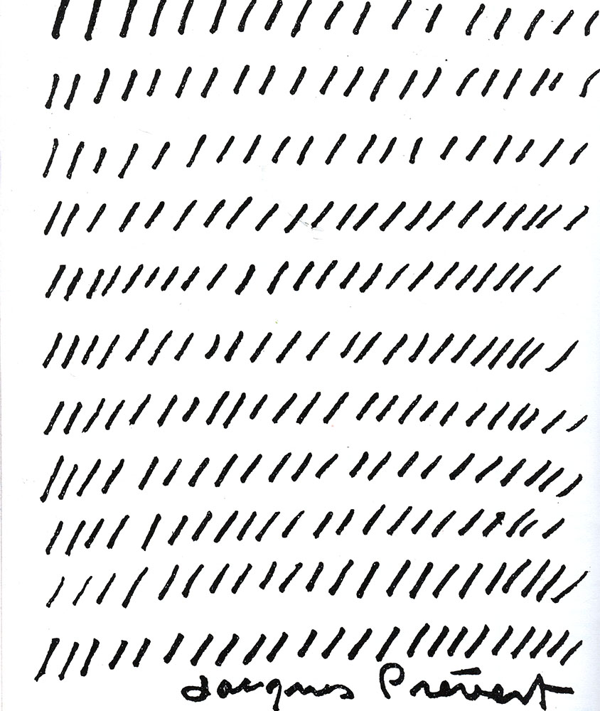
Jacques Prévert (1908-1977) made this drawing in payment for a meal at ‘Trois Canettes’ in Paris.

Rudyard Kipling (1865-1936) illustrated and painted an enormous amount; this drawing (1910) accompanied a letter to his son William with an added P.S of “Wish you were here to share a bath with me”
James Thurber (1894-1961) was well-known as a cartoonist and writer. This drawing accompanies A PORTRAIT OF AUNT IDA, a story about a woman who loves catastrophes and has prophetic dreams of “tall faceless women in black veils and gloves”.

Rabindranath Tagore (1861-1941) became a painter at the age of sixty-seven when he found he could no longer simply cross out a word on a manuscript without the scribble becoming an elaborate design. He said: “My pictures are my versification in lines”.

Antonin Artaud (1896-1948), poet, actor, surrealist, artist made this portrait of Arthur Adamov in 1947, shortly after the playwright helped Artaud gain release from Rodez, the asylum where he had been held for many years.

H. G. Wells (1866-1946) kept a ‘burlesque diary’ in the form of humorous sketches; he made this ‘picshua’ in a letter to his brother in 1890: “What is this?. Why do the people in the tramcar shrink from his presence?… He STINKS.”

Mark Twain (1835-1910) made a burlesque map of the fortifications of Paris. Published in the “New York Herald” of Sunday, October 2, 1870. At this time the siege of Paris during the Franco-Prussian war had just begun and newspapers the world over were filled with maps of Paris as is journalistic practice.
Bruno Schulz (1892-1942) taught art in a secondary school for boys; he made many drawings to accompany his collections of stories and for a short time before he was shot by a Nazi he was given protection by a Gestapo officer who liked his work.

Elizabeth Smart (1913-1986) made this drawing in a scrapbook about the birth of her first child. CHRISTOPHER’S BOOK is full of sketches, poems, details and photographs of the baby.

Hans Christian Andersen (1805-1875) made ‘scissor fantasies’ to illustrate his own tales; he often made these paper cut-outs while telling stories to audiences of children.

Elizabeth Barrett Browning (1806-1861) signed this drawing ‘1860, Oct.7-Villa Alberti Siena-My fig tree-E.B.Browning’. The second inscription is in Robert’s hand.

Mikhail Lermontov (1814-1841)-painter and violinist as writer-was known as a savage wit and tease. He was killed in a duel by a man who did not like the way he was depicted in a caricature the poet had drawn at a party.

Leo Tolstoy (1828-1910) made this drawing as a young officer stationed in the Caucasus; Tolstoy often drew on his manuscripts and the sketch above was found on his copy of YOUTH.

Nikolai Godol (1809-1852) originally intended to be a painter and often illustrated the covers of his own books. This drawing of Pushkin was done in the 1830s.

Charlotte Bronte (1816-1855) often sketched in the drawing room at Haworth with Emily, Anne and Branwell; this drawing shows the writer as an ugly duckling waving goodbye to potential suitors.

Emily Bronte (1818-1848) filled her diaries with drawings of family life; this diary paper shows herself and Anne working at the dinning room table.

Dylan Thomas (1914-1953) made this self-caricature in November, 1943, in the Wheatsheaf Tavern, London.

HOLLYWOOD’S GOLDEN AGE STORYBOARDS - Part 1
Man Hunt (1941)
Director: Fritz Lang
Storyboard: Wiard B. Ihnen
The great Austrian Expressionist director Fritz Lang fled his homeland in the late 1930s (rather than make propaganda films for Joseph Goebbels), and Man Hunt was the first of four anti-Nazi films he made in the U.S. The director of Metropolis (1927) worked with art director Wiard B. Ihnen on this production, which starred Walter Pidgeon as Captain Alan Thorndike, an American soldier and big game hunter who happens upon Hitler’s lodge while hunting in Bavaria and takes aim. Captured, Thorndike is tortured and left for dead by a river—but he finds a rowboat and attempts to navigate it to port without being discovered by the Nazis, who rake the water's surface with a searchlight.
The boards shown here, in graphite pencil, are classic film noir, with large parts of the page left in the dark. Thorndike ("Thorndyke”) must turn in order to avoid the lights before reaching port where he can stow away on a ship to Britain. Ihnen, who was born in New Jersey, trained as an architect and worked for over three decades as a Hollywood art director. He was married to the legendary costume designer Edith Head.
Wiard B. Ihnen’s boards, with their bold use of chiaroscuro, prefigure the expressionistic feel of Lang’s film, which was based on Geoffrey Household’s classic 1939 thriller, Rogue Male.
Thorndike is forced to abandon his vessel when a patrol boat nears.
Captain Thorndike attempts to avoid detection in his rowboat.
The Magnificent Ambersons (1942)
Director: Orson Welles
Storyboard: unattributed
The Magnificent Ambersons is Orson Welles’s tragic masterpiece, his much-hyped follow-up to Citizen Kane (1941). It featured an extravagant set constructed at RKO’s studios—the Ambersons’ mansion, with its moving walls, which provided the setting for Welles’s beloved central ballroom sequence and extensive tracking shots (drastically cut in the theatrical release).
Audacious and daring, The Magnificent Ambersons suffered one of Hollywood’s most traumatic post-production periods. The writer-director had negotiated away his final cut and was working in Brazil on another project when he delivered a (second edit) 131-minute film. It received poor responses from a test audience and RKO took control.
“Everybody they could find was cutting it,” recalled Welles later. It is believed the film went from 131 to 88 minutes, and many sequences were reshot, without Welles’s approval, by the film’s editor, Robert Wise. It was also given a new, more optimistic ending. The edited footage was later destroyed and the original cut has disappeared; all that remains is Welles’s script and some storyboards, unattributed.
The Magnificent Ambersons left Welles with a poor reputation in Hollywood and he struggled to find work after it, yet the film is beloved by critics and cineastes and considered to be one of the greatest movies ever made, its tortured history providing a poignant backstory to the action onscreen.
Albert S. D’Agostino was RKO's art director and supervised the glossy look of all the studio’s films, including The Magnificent Ambersons; he would certainly have had control over the Amberson Mansion, as constructed in RKO’s Gower Street Studios.
The Big Sleep (1946)
Director: Howard Hawks
Storyboard: Bill Herwig
This Warner Bros, production is the Hollywood noir classic; an adaptation of Raymond Chandler's 1939 novel directed by Howard Hawks, co-written by William Faulkner, and starring Humphrey Bogart as hardboiled gumshoe Philip Marlowe, with Lauren Bacall as Vivian Rutledge.
Although the plot is somewhat convoluted. The Big Sleep is still considered one of the greatest movies of that era. The look of the film in particular is spectacular; moodily shot by Sid Hickox, its claustrophobic interiors (with exteriors almost always characterized by rain) were art directed by the renowned German emigre Carl Jules Weyl. As an architect, Weyl designed the Hollywood playhouse (now Avalon Hollywood); under contract at Warner Bros, until 1947, he also designed Casablanca (1942).
The storyboards shown here are credited to Bill Herwig, a former Disney animator of the 1930s, and are a clear indication of the mood of the piece. The original cut of the film in 1945 was re-edited and released in 1946.
Humphrey Bogart as Philip Marlowe with Lauren Bacall as Vivian Rutledge in The Big Sleep.
This page from Bill Herwig’s boards, drawn in pencil, depicts Carol Lundgren— the chauffeur of Arthur Gwynn Geiger, the rare book dealer who is blackmailing Philip Marlowe's client, General Sternwood— preparing to shoot the gambler Joe Brody outside Brody’s apartment.

ART BY DIRECTORS - Part Three
PAINTINGS, DRAWINGS, PHOTOGRAPHS AND STORYBOARDS BY EIGHT FILM DIRECTORS
Written by Karl French
Published in GRANTA magazine #86
John Huston (1906-1987)
Before his directorial debut, The Maltese Falcon (1941), the film that confirmed Humphrey Bogart as a tough-guy star; Huston had been making a good living as a screenwriter; notably for Raoul Walsh’s High Sierra (1941) and Howard Hawks’s Sergeant York (1941); later he would script Orson Welles’s post-war thriller The Stranger (1946). The collaboration with Bogart was the most important in Huston’s long career, and together they would turn out The Treasure of the Sierra Madre (1948), Key Largo (1948), The African Queen (1951), and the underrated oddity Beat the Devil (1953).
Although the 1960s began well with The Misfits (1961), the pessimism of the film was appropriate, with its three stars (Clark Gable, Marilyn Monroe and Montgomery Clift) all close to death and its director set for a dismal run throughout the decade. His career was reborn with Fat City (1972), and remained on a reasonably even keel (the notable low point, in 1981, of Escape to Victory notwithstanding) for the rest of his life.
But things could have been very different. After a serious illness as a ten year old, he was all but bedridden for several years. He emerged with a determination to live an intellectually and physically full life. At fifteen he was introduced to the sport of boxing for which he shared a passion with his father, the actor Walter Huston, who would later co-star in The Treasure of the Sierra Madre. Soon afterwards Huston developed an equally strong passion for painting. ‘Nothing,’ he wrote in his autobiography, ‘has played a more important role in my life.’
He was fascinated by the Cubists, and by the American school of Synchronism. He enrolled in the Smith School of Art in Los Angeles but was soon disillusioned with the aridity of the teaching and what he saw as the pointless discipline of the life classes there. Within months he had dropped out of art school and fallen in with a group of like-minded artists in the Art Students League. He continued to paint throughout his life. Huston had studios in each of his homes, notably St Clerans in Galway, Ireland, a house that also contained much of his art collection, ranging from Paul Klee paintings to his impressive hoard of Pre-Columbian art.
'The Spirit of St.Clerans' (1960s)
Extracts from John Huston's sketchbook, 1956, the year he was making 'Moby Dick' (pen on paper)
Extracts from John Huston's sketchbook, 1956, the year he was making 'Moby Dick' (pencil on paper)
Extracts from John Huston's sketchbook, 1956, the year he was making 'Moby Dick' (pencil and coloured pencil on paper)
Martin Scorsese (b. 1942)
Scorsese’s twin passions as a child and adolescent were the cinema and the Church and for many years he planned to enter the priesthood. But the movies won out and he studied film at New York University, where by the time he graduated he had made a number of short films. Through the 1960s he worked as an editor and also directed his first feature film, Who’s That Knocking on My Door? (1968), a labour of love starring Harvey Keitel, who would become, along with Robert De Niro, one of Scorsese’s favourite actors.
He got his big break, as did Francis Ford Coppola and Peter Bogdanovitch, under Roger Corman, who assigned him to direct Boxcar Bertha (1972). The film was a modest success, but a key moment came when Scorsese screened it for his idol, John Cassavetes, who praised the style but pleaded with Scorsese to go for more personal material. Heeding that advice, Scorsese dusted off an old idea of his based around the characters who had populated his own neighbourhood of Little Italy, in downtown Manhattan, in his youth. Mean Streets, released in 1973, co-starring De Niro and Keitel, made Scorsese’s reputation and established his trademark themes—men, often violent men in crisis, with religion generally in the background or foreground—and a signature directorial style, involving flashy, imaginative visual flourishes, long or otherwise complex takes, and pervasive pop music on the soundtrack.
While occasionally working on more mainstream material, Scorsese turned out a succession of great films, including Taxi Driver (1976), Raging Bull (1980), The King of Comedy (1983), and Goodfellas (1990), all of which bear his personal touch. Many have been script collaborations—Scorsese and Nick Pileggi co-wrote Goodfellas and Casino (1995)—or written wholly by others, most notably Paul Schrader, who wrote Taxi Driver.
Throughout his career Scorsese has carefully storyboarded his own films. With their urgent, primitive stylelessness, these 'storyboards may stretch the definition of art; indeed they may look uncomfortably like extracts from (Taxi Driver’s) Travis Bickle’s illustrated notebooks. But they show Scorsese’s innate understanding of the medium and his talent for framing shots and building sequences—in the examples featured here, sequences that have been etched forever into the minds of a generation of film-goers.
Storyboards for one of the fight sequences in 'Raging Bull' (1980)
Some of Scorsese's storyboards for 'Taxi Driver' (1976)

ART BY DIRECTORS - Part Two
PAINTINGS, DRAWINGS, PHOTOGRAPHS AND STORYBOARDS BY EIGHT FILM DIRECTORS
Written by Karl French
Published in GRANTA magazine #86
Mike Figgis (b. 1949)
Mike Figgis has been taking photographs for more than four decades, a passion made all the stronger by the possibilities of digital photography. As well as being an obsessive note-taker and filer of his notebooks, sketches and other art works, Figgis takes his camera everywhere he goes. The result, aside from serving as an alternative diary, is an exceptional body of work. He spent much of his early childhood in Kenya, returning to north-east England at the age of ten. The upper-class accent he had picked up in colonial Africa set him apart from his peers and he sought refuge in, among other things, photography. Around the same time he fell in love with music—jazz, blues, and rock and roll—and began to play trumpet and guitar. Rejected by the National Film School, in the 1970s Figgis joined the People Show, an avant-garde musical theatre group with which he stayed for more than a decade and where he was able to write, direct, act, compose and perform. Also during this time he played with a number of jazz bands. In 1980 he formed the Mike Figgis Group, and staged various theatrical shows relying heavily on music that he composed and film footage that he directed.
Figgis made his debut in 1988 with Stormy Monday, a stylish, Newcastle-set neo-noir which showed a sureness of touch both in the film’s visual style and his ability to handle a star cast. His first Hollywood film, Internal Affairs (1990), again proved his talent for handling actors, drawing from Richard Gere possibly his finest and certainly his most unsettling performance. The next three films suggested he was still struggling to fit his talent for erotically charged examinations of the human psyche into Hollywood-style moviemaking. Liebestraum (1991) was a low-key thriller, Mr Jones (1993) a disappointing reunion with Gere, The Browning Version (1994) a rather straightforward Rattigan adaptation. But for his next film Figgis stripped the budget to a minimum and shot on 16mm. The result was Leaving Las Vegas (1995), the masterpiece of his career so far, with fine performances from Nicolas Cage as the doomed hero and Elizabeth Shue as his hapless lover.
From then on, Figgis has become ever more experimental, with the dazzling split-screen experiment of Timecode (2000), and Hotel (2001) both exploiting the potential of digital video technology.
Los Angeles Police Department (LAPD) officers arresting suspects, Los Angeles, 1990s
Pen sketch of a friend, Steven, dying from Aids at the Middlesex Hospital, London (1992)
Figgis's mother at his father's funeral (1976)
Satyajit Ray (1921-1992)
As his friend Kurosawa had done for Japanese cinema, so Satyajit Ray was responsible for establishing an international interest in Indian cinema in the 1950s. He achieved this with his serene, wise and assured debut Father Panchali (1955) which, alongside Aparajito (1956) and Apur Sansar (The World of Apu, 1959), became known as the Apu Trilogy—one of the greatest works in world cinema. Again like Kurosawa, in childhood Ray had seemed destined to become a professional artist. He received years of training and achieved some success as an illustrator.
He was born into a well-off Bengali family in Calcutta, and in 1940 he bowed to his family’s wishes and agreed to attend Shantiniketan, the university run by Rabindranath Tagore, who would inspire Ray throughout his career: he adapted several of Tagore’s stories for the cinema and produced a documentary to mark the centenary of Tagore’s birth.
At Shantiniketan, Ray was introduced to Eastern art—Japanese and Chinese as well as Indian. He enhanced his studies by travelling through the country, scrutinizing and sketching traditional Indian sculptures, statues and shrines. He also visited nearby villages to make sketches. This introduced Ray to the humble ways of life that he would explore in his first films.
After university, Ray returned to Calcutta in 1942 and joined a British-owned advertising company. During the next decade (which included a six-month stay in London where he furthered his cinematic education), Ray worked regularly as a freelance illustrator, designing book jackets and posters. He was also a film critic, which is how he came to meet his idol Jean Renoir. He had dreamed since childhood of breaking into movies, and it was while working on the designs for a new edition of Bibhuti Bhushan Bandyopadhyay’s novel Pather Panchali that he became passionate about making it into a film, which he did, coming close to bankruptcy in the process. As his fame grew—and he continued to direct films up to the late 1980s—Ray would still draw illustrations, regularly providing the covers for the children’s magazine Sandesh that had been launched by his father.
A watercolour from 1942, after the Japanese master, Ogata Korin (1658-1716)
Ray's wash-sketches for his first film 'Pather Panchali' (1955)
Ray's woodcut illustration for a 1944 edition of 'Pather Panchali' by Bibhuti Bhusan Bandhopadhyay, the novel on which the film was based
Peter Greenaway (b. 1942)
Greenaway grew up in Wanstead, east London, and after Forest Hills, a minor public school in Essex, went to Walthamstow Art School, which he later described as ‘a breath of fresh air—the novelty value lasted for years, and there I tried to make some sense of an accidental discovery—Bergman’s The Seventh Seal (1957). That film changed everything.’ The other seminal film in his development as a director was Alan Resnais’s Last Year at Marienbad (1961), and if Greenaway fits into any tradition it is that of the 1960s European auteurs, Bergman, Resnais, Godard, through whose work he gained his education in cinema.
This education continued through the 1960s, when he found work at the British Film Institute (BFI) and then at the Central Office of Information, where he picked up experience in film-editing. For years he made small, self-financed, experimental films, until the critical success of The Falls, in 1980, led to The Draughtsman’s Contract (1982), the film that most obviously owes a debt to Resnais. With his template established, he continued to turn out playful, obscure, erudite, and always controversial films at the rate of roughly one every two years.
The central tension in his films is between the human capacity for, and attraction towards, chaos, ugliness and violence, and the ability or desire to impose order on the world through elaborate taxonomy or game-playing. His films are filled with arcane jokes and references and are often broken down into discrete segments—sometimes numbered, as with the dark and and ludic Drowning by Numbers (1988), or colour-coded, as in the case of his gross-out masterpiece, The Cook, the Thief, His Wife & Her Lover (1989). So while his films all contain sex, death, decay, violence, and characters who are either ciphers or loathsome and sometimes both, this is all set within a meticulously realized structure containing a sense of order and attention to detail that is equally crucial to his paintings, sketches and 3-D assemblages. The actor Tim Roth summed up Greenaway’s obsessiveness when he said, only half-jokingly, that during the making of The Cook, the Thief, His Wife & Her Lover the only significant direction he received was to move a couple of inches this way or that to restore the essential symmetry of the composition.
'Gaming Board', 1968 (oil on wood)
'Icarus Falling into Water', 1997 (mixed media on card)
'The Frames', 1981 (mixed media on card)

ART BY DIRECTORS - Part One
PAINTINGS, DRAWINGS, PHOTOGRAPHS AND STORYBOARDS BY EIGHT FILM DIRECTORS
Written by Karl French
Published in GRANTA magazine #86
Akira Kurosawa (1910-1998)
As a child, Kurosawa dreamed of becoming an artist. He was encouraged in this by his primary school teacher and, to a degree, by his father, who insisted he complement his artistic education with a course in calligraphy. On leaving school at eighteen, one of his paintings was accepted for the Nika exhibition, a prestigious annual art festival, but he failed to take his formal training any further.
In an interview towards the end of his life, Kurosawa was asked why he hadn’t become a painter. He replied: ‘Because I failed the exam.’ Again at his father’s insistence he had applied to a famous art school but had been rejected. After this he educated himself, visiting art galleries and studying individual painters. He persevered for a few more years, taking commissions from popular magazines. Then, at the age of twenty-five, having never contemplated a career in films, he answered an advertisement from Photo-Chemical Laboratories seeking trainee assistant directors. He was accepted and began an apprenticeship with the established director Kajiro Yamamoto. He directed his first film, Sansbiro Sugata, in 1943.
Kurosawa was, like his friend Satyajit Ray, fundamentally a humanist film-maker, but he was also a great visual stylist. His films are marked by a painterly quality and he had an unmatched talent for staging fights and action set-pieces. His work is marked as much by Western as by Eastern influences, so it is fitting that his films should have been reappropriated by Hollywood and European directors: his samurai movies, including Seven Samurai (1954), provided the source material for Sergio Leone’s Dollars cycle and John Sturges’s The Magnificent Seven, among others.
Shortly after the release of his first colour film, Dodes’Kaden (1970), Kurosawa attempted suicide. He recovered to make three further masterpieces, Dersu Uzala (1975), Kagemusha (1980) and Ran (1985), which was helped financially by the intervention of George Lucas and Francis Ford Coppola. It was in the long preproduction periods on these last films that he made detailed preparatory sketches in his trademark style—which owed a clear debt to Van Gogh and the Impressionists. His passion for Van Gogh was particularly evident in his penultimate film, Akira Kurosawa’s Dreams (1990), in which the elderly director meets Vincent, played by Kurosawa-worshipper Martin Scorsese.
A sketch for 'Akira Kurosawa's Dreams' (1990), in which Martin Scorsese plays Vincent Van Gogh
Alfred Hitchcock (1899-1980)
First inspired by German Expressionist cinema, Hitchcock quickly developed his signature style of suspense film-making. His films returned again and again to the same psychological territory—fear of authority figures, overbearing mothers, false accusations (with innocent men drawn into desperate situations by malign fate)—and incorporated elaborately staged set-pieces and extended takes. They also included his own often cheeky cameo appearances.
For all his willingness to discuss his technique and philosophy of the craft of movie direction at great length, like some populist Eisenstein, he professed (as would Woody Allen decades later) a distaste for the actual process of film-making. Allen attributed his own feelings to a discomfort in dealing with actors and continual disappointment in the results compared to the image he had of the film in his head. Hitchcock felt, or claimed to feel, that rendering the action on celluloid was almost redundant, since he had already created the films in the elaborate storyboarding sessions that preceded each production. Although he usually employed a professional storyboard artist, and when he contributed his own sketches they tended to be hastily prepared and very rough, Hitchcock was a gifted draughtsman and, as his preparatory sketches for The 39 Steps (1935) show, he could produce atmospheric work of high quality.
He left school in his early teens and went to work for the Henley Telegraph and Cable Company. He also took night classes in life drawing at the University of London and received a rudimentary education in the history of black-and-white illustration. When this came to the attention of his employers he was moved to the advertising department, where he churned out images over the next few years. In 1920 the American company Famous Players-Lasky opened a film studio in north London and Hitchcock went to work there, initially unpaid, supplying title cards for silent films. He was eventually made head of titles. He directed his first film, The Pleasure Garden, in 1925, and over the next fifty years an extraordinary run of suspense masterpieces followed, including The 39 Steps (1935), Notorious (1946), Strangers on a Train (1951), Rear Window (1954), Vertigo (1958), North by Northwest (1959), and Psycho (1960).
Janet Leigh in the shower sequence from 'Psycho' (1960)
Some of the few preparatory drawings for "The 39 Steps" (1935)
Some of the few preparatory drawings for "The 39 Steps" (1935)
Some of the few preparatory drawings for "The 39 Steps" (1935)
Some of the few preparatory drawings for "The 39 Steps" (1935)
Takeshi Kitano (b. 1947)
After what seems to have been a miserable childhood, in which he and his siblings were subject to their father’s violent outbursts (his father would later be the basis for the central character in his 1999 film, Kikujiro) Kitano dropped out of university and became apprenticed to a comedian. He joined up with Jiro, another young stand-up comic; they styled themselves ‘The Two Beats’ (hence Kitano’s stage name, Beat Takeshi, which he still uses as an actor) and became a cult success in Japan with their outrageous, often obscene stage act which in time they brought to television.
In 1982, the director Nagisa Oshima cast Kitano against type as the brutal Hara in Merry Christmas, Mr Lawrence. In Japan his fame as a comic affected him adversely, with audiences reputedly hooting with laughter at his every appearance on screen, despite the violence of his character. His next sideways move was equally dramatic, when he emerged as a gifted director on his first film, Violent Cop (1989).
It was an accident which led Kitano to take up painting. On the night of August 2,1994, after finishing his role in Johnny Mnemonic, he had a few drinks and went for a ride on his new motorbike. He crashed, fracturing his skull and cheekbone. He admitted later he wasn’t sure where he was going that night, or even whether or not it had been a suicide attempt. ‘I even thought my brain structure might have been changed and that it might make me more artistic,’ he said later. ‘It even convinced me to start painting.’
He made a successful return to film-making with Kids Return (1996), but his masterpiece came in 1997 with Hana-Bi, in which he also plays the leading role as Nishi, a retired cop who alternates between acts of casual but extreme violence and tenderness in caring for his sick wife. Kitano had been planning this film before his accident, but his brush with death clearly informs its mood. Many of the paintings he made during his convalescence are woven seamlessly into the film, presented as the art work created by Nishi’s wheelchair-bound former partner Horibe. There is something perfect about these dreamy images in which flowers meld with animals, dovetailing with the film’s emblematic title, which consists of the Japanese word for fireworks broken down into its constituent parts: hana (flower), bi (fire).
Kitano painting which feature in his film "Hana-Bi" (1997)
Kitano painting which feature in his film "Hana-Bi" (1997)
A cartoon angel which appeared in Kitano's 1999 film "Kikujiro".
Kitano's failed attempt to copy Van Gogh's "Sunflowers", which he turned into a visual joke.
Another painting used in "Hana-Bi". The snow is made of thousands of copies of the Chinese pictogram for snow;the symbol at the centre means suicide.

Un tratamiento a cuatro cuadros. Entrevista con Mike Figgis
A juzgar por su apariencia bohemia, uno pensaría que Figgis es un chaman, un profesor universitario o, mas acorde con sus verdaderas habilidades, un jazzista. De hecho, en tanto director y compositor consumado, Figgis a menudo ha tornado el camino menos transitado componiendo la música de sus películas. Y mucho antes de que Adiós a Las Vegas (1995) lo convirtiera en un director ingles con éxito en Hollywood, Figgis estuvo experimentando con producciones multimedia que combinaban acción viva con música y cine.
Time Code, su primera película en video digital lo hizo volver a esas raíces. Filmada en tiempo real con cuatro cámaras Sony DSR-1 (adaptadas a sus necesidades) durante 93 minutos de manera ininterrumpida (la duración de la cinta digital), es un audaz experimento que aborda la película como si fuera una compleja composición orquestal. Mientras improvisaban sus diálogos, los actores principales utilizaron relojes sincronizados para ver donde estaban en el desarrollo de la historia, el cual Figgis había planeado y registrado de manera meticulosa en hojas para partitura.
¿No se corre el riesgo de fomentar cierta falta de cualidades artísticas al recomendar a los realizadores que trabajan con video digital que se sientan con la libertad de experimentar en todo sentido?
Sin duda, estan por hacerse miles de peliculas de calidad inferior que puede que encuentren o no un mercado. Algunas realmente malas, meramente comerciales y burdas se volveran grandes exitos. Y las obras geniales seran ignoradas. Pero eso pasa en cualquier medio.
A mi simplemente me gusta la idea de que, asi como cualquiera puede escribir un libro si tiene lapiz y papel, ahora todo mundo puede hacer una pelicula. Esto abre posibilidades de un medio menos elitista y menos basado en la tecnologia.
Dices que no tienes muchas ganas de hacer otra película en 35mm. Me imagino que es menos por la imagen que por el proceso.
Adquiri mi propia Super 16 Aaton y puedo usarla en combinación con un enfoque digital. Me he hecho de un par de camaras digitales con las que me siento muy feliz. De modo que ahora tengo herramientas suficientes para decidir como filmar. Me encanta el cine. Me gusta el celuloide. Pero el Super 16 me funciona perfectamente. De hecho prefiero la estetica del 16mm a la del 35mm. Te da una imagen con una apariencia un poco menos fina, menos nitida, mas impresionista. Ahora el 35mm me parece demasiado clinico; en realidad tiene la apariencia del video de alta definition. Siento que es como si hubiera una correspondencia entre ellos.
¿Podrías haber hecho Adiós a Las Vegas en video digital?
En este momento, de haber tenido las camaras con las que filme Time Code, lo habria pensado. Adios a Las Vegas fue un proyecto tan dificil en cuanto al presupuesto, que cualquier forma de bajar el presupuesto sin perder calidad me habria interesado. Pero creo que el Super 16 fue perfecto para la pelicula.
¿Por que decidiste hacer Time Code en video digital?
Siempre ha sido una fantasia de muchos cineastas filmar en tiempo real, sin cortes. Antes uno estaba limitado por la duracion del rollo. Ahora por primera vez es posible rodar una pelicula durante 90 minutos sin un solo corte. Empece a jugar con la idea en mi cuaderno de notas. Uno de los problemas es que si filmas una pelicula de 90 minutos con una sola camara, estas restringido al hecho de que la camara solo puede estar en un sitio a la vez. Desde Iuego, lo grandioso del cine convencional es que la edicion te permite cortar cuando quieras y en cualquier lugar. Asi que pense que la unica manera de conseguir ese efecto era tener un formato de varias pantallas.
Dado que la necesidad es la madre de la inventiva, comence a hacer diagramas y se me ocurrio la idea de filmar con cuatro camaras y tener en pantalla cuatro acciones paralelas que presentaran todas las facetas de una misma historia. Me senti sumamente entusiasmado cuando pense que, por lo menos tecnicamente, era perfectamente posible.
Lo mas complicado era la regrabacion. Era verdaderamente dificil, pues para ello tenia que tomar decisiones acerca del dialogo de las diversas pantallas. No fue facil. Si en las cuatro pantallas tienes mas de diez personas, digamos, hablando todo el tiempo, simplemente enajenas al publico y no es posible escuchar claramente lo que estan diciendo. Si, por otra parte, subes un poco uno de los dialogos y estas usando las bocinas ambientales y ecualizas todas las voces de manera un poco distinta, encuentras que puedes dife- renciar lo que esta diciendo la gente, como si estuvieras en el vestibulo de un hotel. Pero tienes que orientar sutilmen- te el ojo, sin que sea obvio, mediante un enfoque muy sofisticado del audio, procedimiento que se acerca mucho a como es en la realidad.
¿De que te serviste para ayudar a los adores a aceptar el reto?
Sin duda lo que mas sirvió fueron las ventajas tecnológicas. Si grabas en video y estas filmando 93 minutos en tiempo real y comienzas en la mañana, para el almuerzo ya terminaste, y el técnico de video inmediatamente hace cuatro copias, transfiriendo con un aumento de la calidad de la cámara digital a DigiBeta con el mismo código de tiempo. Entonces reproduces las cuatro cintas en cuatro monitores dispuestos a diferentes alturas en un cuadrante, con cuatro salidas hacia una mezcladora. Lo importante para ellos era ver la dinámica en la que participaban, el verse en contexto. Si un actor realmente se esta pasando de la raya -pues todos están improvisando ?%94 y esta siendo egocéntrico, no hay nada mas contundente que verte frente a los otros 27 actores sentados juntos. Yo no podría decir nada a un actor que tuviera la misma fuerza ni el mismo efecto que el hecho de que ellos vean lo que están haciendo. Nos sentamos en circulo y los invite a todos a hacer comentarios. Yo puedo decir: «Bien, esto es lo que yo creo: funciona, pero en el minuto 1:43 se traslapan sus diálogos, de modo que tenemos que reorganizar un poco la secuencia.
¿El titulo de Time Code alude sobre todo a ese proceso?
Si, este film se basa completamente en la tecnología del código de tiempo. Usamos micrófonos de radio de veintisiete canales, además de los micrófonos de las cámaras y los que fueron instalados, pues no había posibilidad de usar canas en ninguna parte porque estábamos usando cuatro cámaras. Por tanto tenia que hacerse que la imagen y el sonido casaran por algún medio, y para ello utilizamos el código de tiempo. Pienso que en todo caso es una frase provocativa.
Como compositor, prestas mas atención a la musicalización que la mayoría de los directores. ¿Hizo alguna diferencia tu enfoque musical en este proyecto particular?
Una diferencia muy interesante, pues no solo permitió que los actores abordaran su ejercicio actoral sobre una base diaria, sino que, como estuve realizando cada noche estas mezclas en vivo, también introduje un gran numero de CDs y probé diferentes maneras de abordar la música. Esto fue inspirando cotidianamente su actuación. Por ejemplo, utilice algunas piezas de música de cuerdas realmente lentas y con cierta fuerza, y los actores comenzaron a ajustar su estilo a sabiendas de que esa era la forma en que se iba a desarrollar la escena y así era como podría salir con la mezcla final. Se volvió una especie de ejecución a dos manos entre los actores y la música. Lo cual también es interesante si luego cambias de opinión, pues puedes ir contra esa tendencia con la música, cosa que he hecho en un par de casos.
De igual modo, la manera en que se escribió el film en tanto historia es realmente como una composición musical en papel pautado. Cada una de las cuatro cámaras tiene un pentagrama musical y cada barra representaba un minuto, de modo que todo el film fue planeado en cierto sentido como si fuera un cuarteto de cuerdas. Debido a mi formación musical, esa fue la única manera en que pude registrar la operación de las cuatro cámaras.
¿Has pensado en integrar la red al proceso de desarrollo de una película?
Lo he pensado, pero tengo la teoría de que la red es una especie de renacimiento de la literatura y la palabra escrita. En realidad yo me siento feliz con una pluma fuente y un cuaderno, y la red es una forma de hablar e intercambiar ideas e investigar. Para mi Internet es en cierto modo algo pavoroso: demasiadas posibilidades, demasiadas opciones.
¿Alguna idea de que viene después de Time Code?
Solo quiero ir a la cama y dormir durante un año
Entrevista realizada por Marco Masoni en Febrero del 2001.
